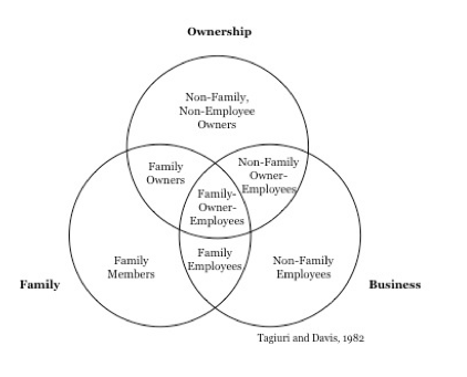
 In 1982, Harvard Business School professors Renato Tagiuri and John Davis published an article in Family Business Review that changed the way people understand family businesses. It was based on a model they developed at Harvard in the ’70s. Until this point, there had been several attempts at explaining the family business system, but no one had cracked the code. Over 30 years later, this framework is still drawn by entrepreneurs, academics, and consultants all over the world. It’s been referenced, challenged, and expounded on in scores of articles, seminars, and blog posts. What’s the model? Three circles.
All it took was three circles?
Yes. In fact, two of them already existed. Tagiuri and Davis just added the third. Before this model, people thought of family businesses as two overlapping circles – the family circle and the business circle. Tagiuri and Davis added the third circle of ownership. This finally addressed the dynamics that couldn’t be explained with the two-circle model. The rest is history. The diagram below has been drawn and redrawn countless times in board rooms, classrooms, and living rooms. Why? Because it so clearly and efficiently explains a complex concept. According to John Davis, “Its durability is because it is simple.”
This is what makes the best business concepts stick.
Tagiuri and Davis aren’t the only ones who have done this. In fact, many of the most powerful business concepts – the ones with real staying power – are based on a simple diagram like this. Think about Geoffrey Moore’s famous “Crossing The Chasm” picture. It’s just a bell curve with a line through the middle. And yet, it changed the way people think about new product innovation. I’ve redrawn it myself in strategy sessions and client presentations.
Then there’s Boston Consulting Group’s “Growth-Share Matrix”. The famous “Hedgehog Concept” from Good To Great (another “three circles” diagram). And more recently, Simon Sinek’s “Golden Circle”. The majority of Sinek’s 18-minute TED Talk (that became one of the most viewed TED Talks of all time) was based on him drawing this diagram on a flip chart.
If whiteboarding works so well, why don’t we do it more?
If pictures are that powerful, you’d think they would show up in B2B sales messaging all the time. But they don’t. Why would sales professionals not want to tap into such a dynamic tool? I think it comes down to one huge hurdle: complexity. Most of the current approaches to whiteboarding are far too complicated. If you look at the books, blogs, and videos on how to whiteboard in sales presentations, it’s enough to scare off even the most seasoned sellers. The genius behind all the famous examples above is their simplicity.
Go easy.
If you’re looking to make your sales message stick, then look for a really, really easy way to illustrate what’s going on in your prospect’s world. Keep in mind that it can be based on an existing framework. Two of the examples above even use the same one (a Venn diagram). Try a few different pictures until you get to something uber simple. Remember, less is more. Then, use this new sketch in your next pitch, and watch what happens.
To get a jump start, check out our infographic: 5 Instant Whiteboards for B2B Selling

Wow, I didn’t know that there was so much science as to how a whiteboard works. All I care about is choosing the right one for my needs. Do you have any other tips? I just want to be able to draw the diagram you talked about on my own whiteboard for my business!